


BRIEF
Muntons, a British malt-producing company, wanted to promote their British malt in the United States through both digital and print formats. The goal was to highlight the heritage and quality of the product while capturing the attention of an American audience.
CONCEPT
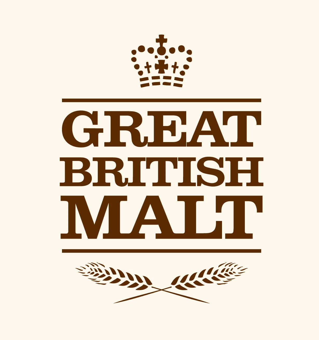
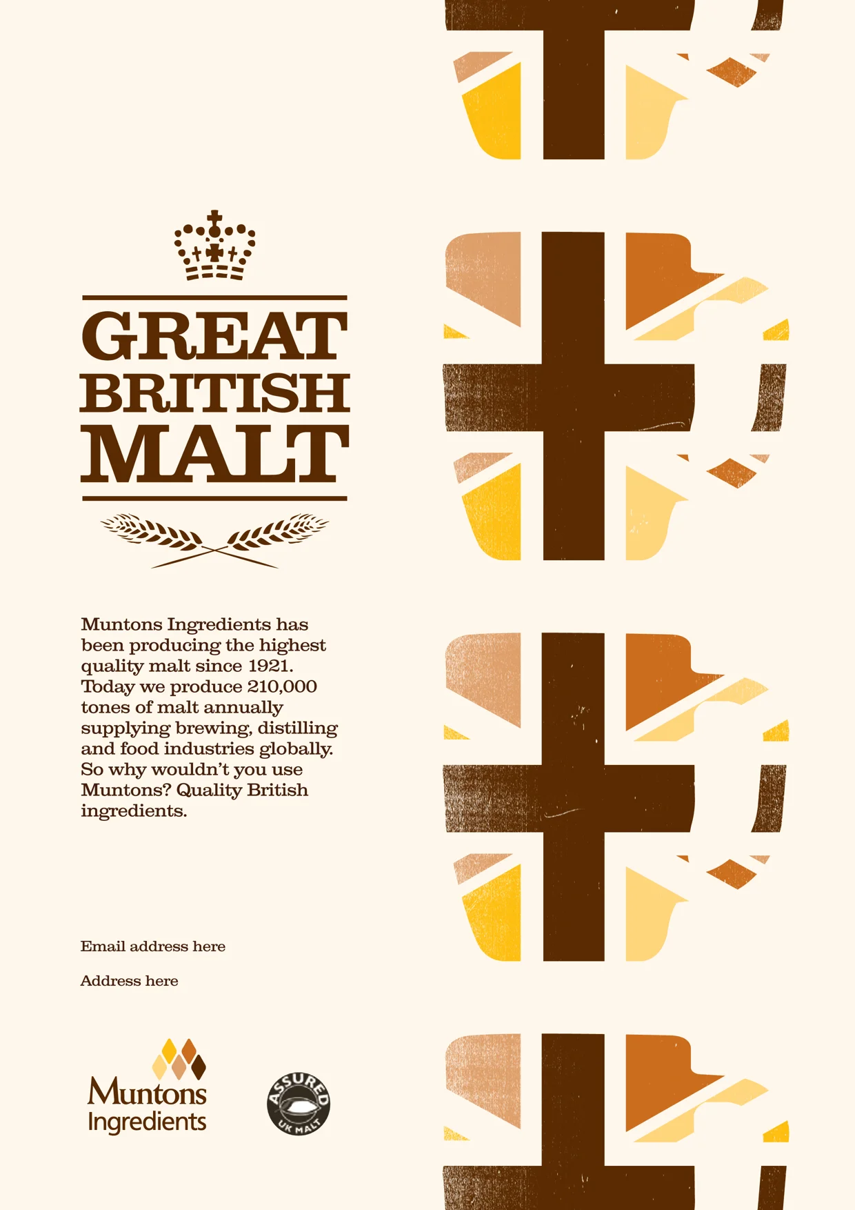
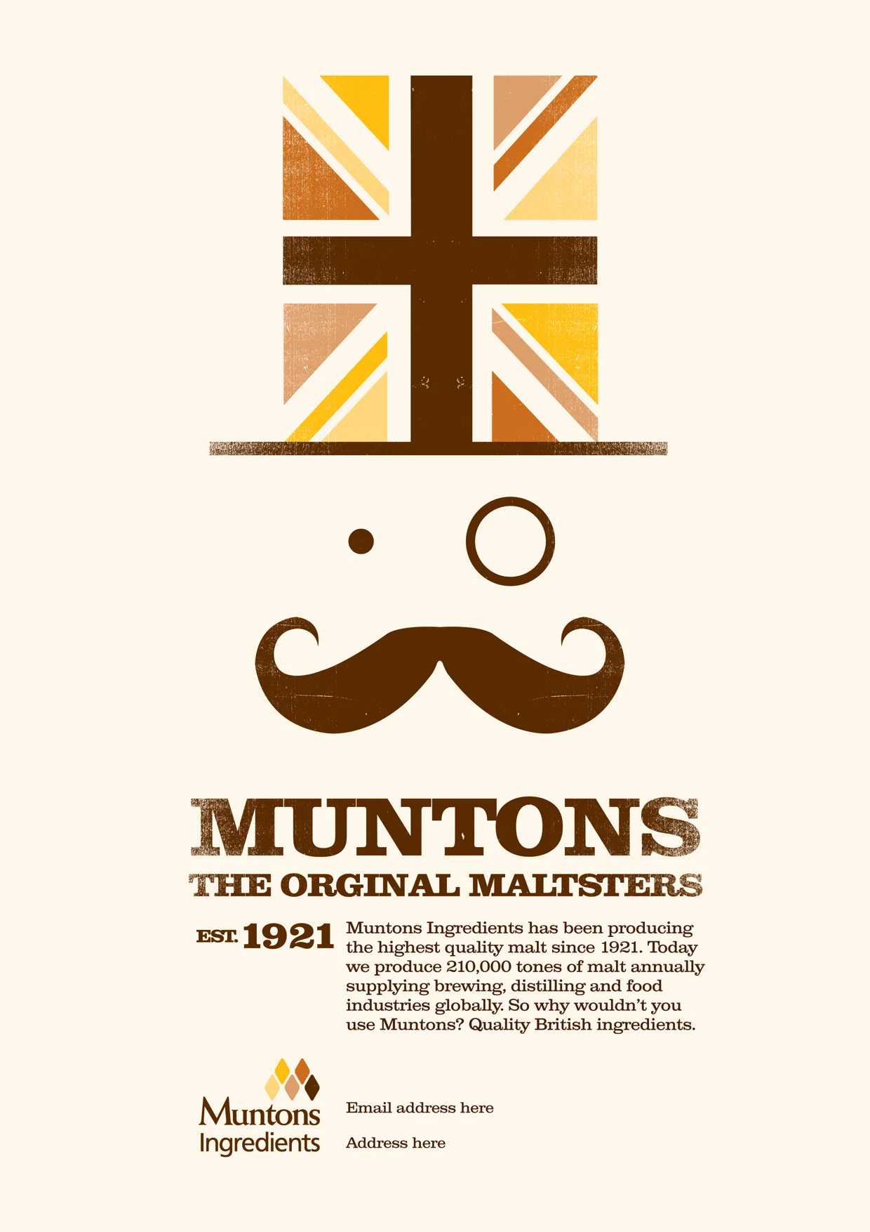
The creative plays up to the charming stereotype of British culture, leveraging stylised imagery and cultural references to create an instantly recognisable visual identity. The phrase “Great British Malt” is prominently featured, reinforcing the product’s authenticity and its connection to British craftsmanship. The playful, tongue-in-cheek approach adds a layer of personality to the brand, making it both memorable and engaging for an American audience.
The execution uses a screenprint style on textured paper, creating a tactile, artisanal feel that reflects the natural, hands-on process of producing malt. This design choice not only reinforces the brand's authenticity but also adds a touch of craftsmanship and care, emphasising the quality of Muntons’ product. The combination of traditional British imagery with modern design techniques creates a compelling contrast that captures the essence of the brand in a fresh and appealing way.
ROLE
- Creative concepts
- Art direction
- Visual design