BRIEF
Inspired by Creative Cups 2023, Nespresso tasked us to expand the universe for B2B and B2C audiences within the Flavoured and Milk worlds, requiring hero films, KVs and social assets. These deliverables were put the spotlight on a new recipe, Maple Pecan, and new capsules and machines.
IDEA
Our idea focused on the spectrum of creativity, evoking the notion of every coffee – whether classic or avant-garde - is crafted with creativity. In a nutshell, we encapsulated the idea as ‘Master Simplicity, Express Creativity.’
EXECUTION
Heroing the recipes and body of the coffee, we concepted indulgent and visually captivating ‘liquid treatments’, along with developing a new colour palette and bespoke set builds for the two worlds.
OUTCOME
Our week-long shoot saw us deliver a super successful campaign with hundreds of assets rolling across global markets. What’s more? Sales of the elevated VL machines went up by 30% alongside Nespresso’s new flavour, Maple Pecan, proving a hit online.
BRIEF
Create a digital product experience showcasing the taste journey of the Kinder Pingui bar through a “playful” lens, capturing the taste pillars of freshness, crunchiness, creaminess and the overall “mmm” effect.
IDEA
Immersing into the playful universe of Kinder, the idea quite literally takes you on a taste journey through a chain reaction style video. Filmed in a one-shot style, the idea sees each pillar fluidly flowing into the other – delicious dripping chocolate, droplets, cool mist, a domino effect, cracked shards and a hypnotic whirlpool of cream.
EXECUTION
We captured the mesmerising visuals using bespoke live-shot props and CGI; each crafted to bring taste appeal and seamlessly link to the next shot. Tailored headlines interacted with the product, reflecting the pillars i.e., ‘crunchy’ as a headline, cracks the chocolate coating. This was all brought together with dreamlike music and SFX to heighten the unique experience.
OUTCOME
The hypnotic master film led the way for further social videos and social statics to be amplified across platforms, each highlighting a unique pillar and taste experience.
BRIEF
Dyson is the must-have haircare brand, making it perfectly positioned to tap into the growing male grooming market. They briefed us to create two 30-second films on the Supersonic hairdryer for male consumers in East and West markets, plus 6-second cut downs, and a suite of stills assets.
IDEA
The main ask was to hero the hairdryer and the styles it can achieve. Working with such a beautiful product, we wanted to focus on its curvaceous design, while showcasing its advanced tech. All while creating a defined identity for the East and West films with subtle set changes, day and night lighting differences, and different hairstyles for different occasions.
EXECUTION
We used the iconic Supersonic ring as a visual device to cut from the hairdryer to the final hairstyles shot face-on in a circular mirror. An immersive locked-on product shot enabled seamless transition between East and West scenes, while CGI showcased the technology in action. Snappy supers supported the visuals, and landed the product benefits throughout.
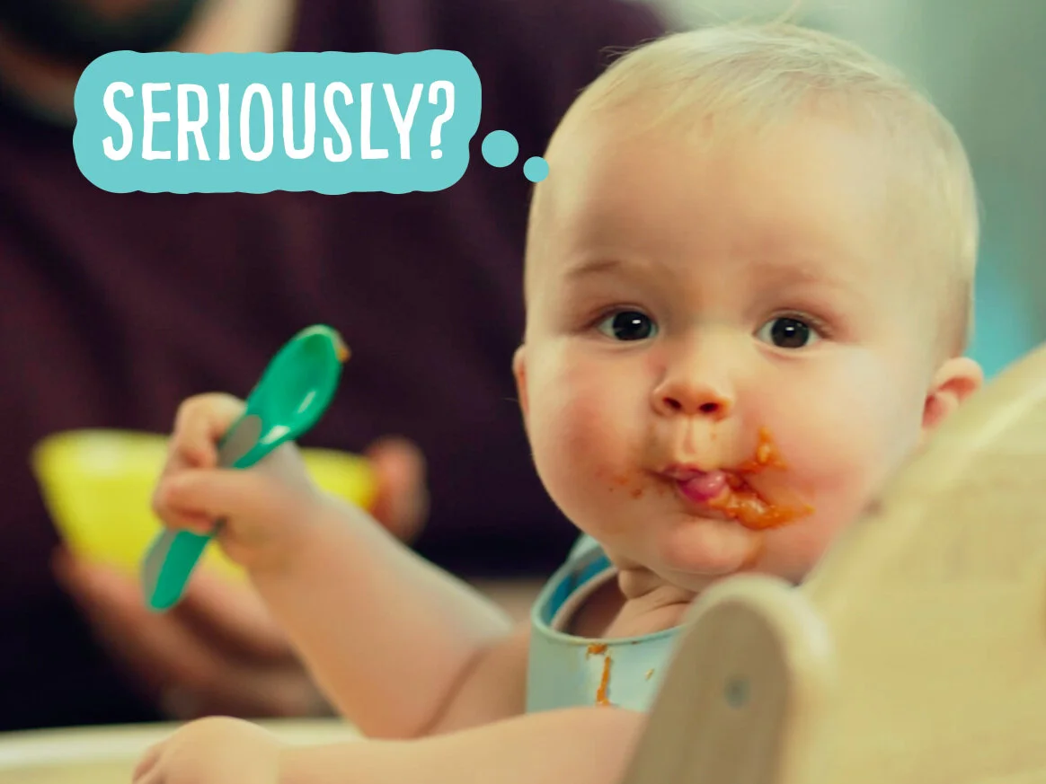
IDEA
This charming campaign revolves around babies being perfectly honest, through their thoughts we glimpse into their world. They tell it like it is, sharing their take on life and the great taste of Heinz Baby Food in humorous, entertaining ways. We’ll capture all the mayhem, mess and magic of mealtimes – those moments that every parent can empathise with, warm to and want to share with others. This campaign will show that Heinz understands what parents go through to give their babies the best, the executions will reassure them that giving your baby Heinz is a perfectly natural thing to do.
ROLE
- Creative concepts
- Storyboarding
- Art direction
BRIEF
Create a fresh suite of video content for Sainsbury’s Little Twist campaign, ensuring it aligns seamlessly with the new "food dancing" visual identity. The aim was to capture the fun, approachable, and imaginative spirit of the brand while showcasing how Little Twists can bring excitement to everyday meals.
CONCEPT
The Little Twist videos were designed to embody energy, creativity, and playfulness, translating the campaign’s essence into engaging motion. By combining upbeat and conversational language, bold animated typography, and lively, rhythmic editing, the videos brought a fresh vibrancy to the table. Every element—from the pacing to the tone—was crafted to make the content irresistibly fun and dynamic, encouraging viewers to see the joy in simple culinary twists.
ROLE
- Creative concepts
- Storyboarding
- Art direction
BRIEF
Develop a compelling creative concept for an Expedia content film that captures the breathtaking beauty, rich culture, and unforgettable experiences South Africa offers as a premier tourist destination. The film needed to resonate with a global audience and be optimized for a wide range of social media platforms, ensuring it would inspire and engage travelers worldwide.
CONCEPT
Told through the lens of a solo female traveler, the film offers an intimate and immersive journey into South Africa’s wonders. Shot in a dynamic first-person perspective, it captures her personal story of exploration—overcoming fears, forming unexpected friendships, and experiencing life-changing encounters with the region's incredible wildlife and vibrant culture.
To add an emotional layer, the narrative unfolds through her instant messages to a loved one, sharing moments of awe and discovery in real-time. The story builds to a heartwarming twist as her loved one surprises her by joining the adventure, symbolising the transformative power of travel and connection.
With its blend of visually stunning landscapes, relatable storytelling, and a touch of heartfelt emotion, the concept brings South Africa’s magic to life in a way that inspires wanderlust and sparks curiosity.
ROLE
- Creative concepts
- Storyboarding
- Art direction
BRIEF
Develop a campaign to introduce Birdseye’s Green Cuisine range of vegetarian meat substitutes, emphasizing their bold flavors and hearty textures. The objective was to challenge preconceptions about veggie burgers, positioning them as a delicious, satisfying alternative to traditional meat-based options.
CONCEPT
Green Cuisine is not what you'd expect from a typical veggie burger. Big, juicy, and packed with flavor, they surprise even the most skeptical of eaters. To reflect this juxtaposition, the campaign centres around an unexpected fan of the burgers someone you’d never associate with vegetarian food. This twist sparks intrigue and humor, flipping perceptions of plant-based meals while showcasing just how indulgent and satisfying Green Cuisine can be.
Through playful storytelling, bold visuals, and a touch of wit, the campaign challenges stereotypes, appealing to curious meat-eaters and vegetarians alike. It’s not just about veggie burgers it’s about breaking expectations and embracing the unexpected.
ROLE
- Creative concepts
- Art direction
- Visual design
BRIEF
Design a fresh and engaging look and feel for Pearson’s revision guides, targeting teenagers and aiming to make studying feel more approachable and empowering. The challenge was to create a visual identity that resonated with a younger audience while staying true to Pearson’s educational authority.
CONCEPT
The design centers on bold, typography-led visuals that are modern, confident, and relatable. Using a striking combination of strong typefaces and vibrant colors, the guides inspire positivity and self-belief. Each subject is brought to life with words and phrases that connect with teenagers motivational, relevant to their world, and tied to the core themes of their studies.
This design approach repositions revision as something cool, accessible, and achievable. By blending eye-catching design with empowering messaging, the new look transforms the guides into tools teens actually want to pick up, making exam prep feel less daunting and more dynamic.
ROLE
- Creative concepts
- Art direction
- Visual design
BRIEF
Design a compelling visual identity for WPP’s training programs, tailored to resonate with a Millennial audience. The objective was to transform traditionally dull corporate content into something dynamic, engaging, and culturally relevant, ensuring the programs captured attention and inspired participation.
IDEA
The creative approach focused on turning the ordinary into the extraordinary by crafting a bold, graphic visual style. Drawing from cultural references and trends that connect with Millennials, the design added vibrancy and personality to the programs, making them feel fresh and relevant.
Through a mix of eye-catching visuals, contemporary typography, and playful elements, the identity brought energy and excitement to the training content. This cohesive style extended seamlessly across all media channels, from digital platforms to print materials, ensuring a consistent and memorable presence.
The result? A training program identity that stood out, captured the spirit of its audience, and elevated the learning experience with a creative edge.
ROLE
- Creative concepts
- Art direction
- Visual design
BRIEF
Develop an online campaign for Booking.com that targets holidaymakers with a specific passion, inspiring them to explore travel destinations tailored to their interests. The challenge was to create an engaging, immersive experience that brought their passions to life and connected them with the perfect getaway.
CONCEPT
The campaign leverages a first-person perspective to place viewers directly in the heart of their passions, creating the illusion that they’re living out their dream holiday. Whether it’s skiing down alpine slopes, diving into crystal-clear waters, or savoring local cuisine at a bustling market, the content transports viewers to these moments, making them feel personal and tangible.
This immersive approach extended across dynamic online banners, interactive installations and engaging social media content. Each touchpoint captured the sensory excitement of travel, encouraging users to envision themselves in these experiences and book their next adventure through Booking.com.
By blending striking visuals with interactive storytelling, the campaign inspired passion-driven travel, turning dreams into actionable bookings.
ROLE
- Creative concepts
- Art direction
- Visual design
BRIEF
Develop a TV commercial to introduce McVitie’s to the Spanish market, showcasing the brand’s heritage and quality. The objective was to highlight the simple pleasures McVitie’s offers while creating a visually distinct and memorable identity tailored to the new audience.
CONCEPT
The TVC celebrates the charm of McVitie’s by dramatizing the little moments that make their biscuits so special. From the satisfying crunch to the timeless taste, every detail is brought to life through a clean, visually striking style.
Set against bold, on-brand red backdrops, the scenes are infused with warmth and sophistication, using long shadows and minimalist compositions to create an elegant yet inviting aesthetic. The simplicity of the visuals mirrors the simplicity of the product’s appeal—timeless, comforting and unmistakably McVitie’s.
This approach not only honors the brand’s heritage but also introduces it to the Spanish market in a way that feels fresh, confident, and visually unforgettable, leaving a lasting impression on its new audience.
ROLE
- Creative concepts
- Art direction
- Visual design
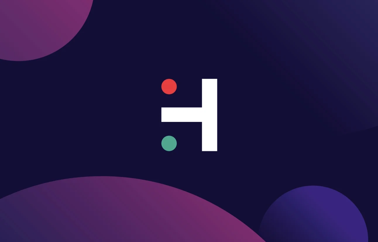
BRIEF
Develop a series of engaging idents to showcase the diverse areas of Hogarth’s business. The objective was to create a cohesive and visually striking set of animations that communicated the company’s expertise while maintaining a strong brand identity.
CONCEPT
The Hogarth “H” takes center stage as the focal point of each ident, serving as a dynamic canvas to represent the different facets of the business. Animated elements tailored to reflect each specific area flow around and interact with the “H,” creating an immersive yet stylish visual experience.
From creative production to technology and global delivery, each ident blends sleek motion design with purposeful storytelling. The minimalist yet impactful approach emphasizes Hogarth’s innovative edge and versatility while reinforcing its brand identity across all touchpoints.
These idents not only celebrate the breadth of Hogarth’s expertise but also provide a polished and memorable representation of its capabilities, leaving a lasting impression on clients and collaborators alike.
ROLE
- Creative concepts
- Art direction
- Visual design
BRIEF
Create an out-of-home advertising campaign for Coca-Cola to be displayed in train stations nationwide, heralding the return of the brand’s iconic Christmas message, “Holidays Are Coming.” The goal was to build festive excitement and connect with travelers heading home for the holidays.
CONCEPT
The ad directly speaks to those on the move, with the message “Wherever you are going. Holidays are coming,” tapping into the emotional connection many people feel when traveling to be with loved ones during the holiday season.
The design concept integrates a bespoke animated train illustration that moves seamlessly across the iconic Coca-Cola wave, perfectly suited to the expansive scale of the train station billboards. The animation adds a sense of magic and movement, tying into the theme of journey and anticipation.
Utilszing Coca-Cola’s signature red and white color scheme and vector-style graphics, the ad stands out as instantly recognizable, evoking nostalgia and holiday spirit. The combination of warm, festive messaging with the playful animation creates a truly captivating experience for commuters, making it a memorable part of their holiday travels.
ROLE
- Creative concepts
- Art direction
- Visual design
BRIEF
Create an advertisement for EY that explores the thought-provoking question, “Does collision shatter or shape our future thinking?” The objective was to visually communicate how the concept of collision whether physical, intellectual, or metaphorical can lead to growth and innovation rather than destruction.
CONCEPT
The campaign uses the unexpected combination of two animals to symbolise the transformative power of collision. By pairing two distinct creatures, we illustrate that when different forces or ideas come together, they can create something entirely new and beneficial. This visual metaphor reinforces the idea that collisions don’t necessarily have to be negative; they can lead to positive outcomes, shape new perspectives, and drive innovation.
The choice of animals was key to the concept, selected for their symbolic meaning of strength, harmony, and adaptability. The resulting imagery was both striking and thought-provoking, sparking curiosity and encouraging viewers to reconsider how they view challenges and conflict.
Through this creative approach, the advertisement captured EY’s forward-thinking ethos while inviting audiences to embrace the potential for growth through change and collision.
ROLE
- Creative concepts
- Art direction
- Visual design
BRIEF
Develop a series of online content films for Benzac’s new line of products aimed at preventing blackheads, specifically targeting teenagers. The goal was to create engaging, relatable content that resonates with the young audience while promoting the effectiveness of the products.
CONCEPT
The narrative is brought to life using playful animations that interact with the protagonist a teenage girl creating a fun and dynamic visual experience. These animations act as charming characters or elements that work alongside the girl, adding an engaging layer of creativity to the storyline.
By blending the real world with animated visuals, the films capture the attention of the target audience while keeping the tone lighthearted and relatable. The animation serves not only as a visual tool but also as a way to personify the girl’s journey to clearer skin, making the experience feel more interactive and fun.
This approach not only highlights the benefits of the Benzac product line but also connects with teens on an emotional level, ensuring the content feels authentic, engaging, and aligned with their lifestyle.
ROLE
- Creative concepts
- Art direction
- Visual design
BRIEF
Create a visual identity for BONDS, a creative recruitment agency with a strong ethos centered around bringing people together. The brand needed a look and feel that visually communicated connection, collaboration, and unity, while also standing out in a competitive market.
CONCEPT
The core concept was inspired by the brand name itself—BONDS—with the logo design reflecting the idea of connection and merging. By splitting the BONDS logo in half, we created dynamic shapes that evoke the coming together of two distinct sides. These split elements are used as a central device across various brand assets, from stationery to digital materials, reinforcing the concept of unity and collaboration.
The combination of two complementary images—each one distinct but naturally sitting together—mirrors the brand’s mission of bridging talent and opportunity. The result is a visual identity that feels fresh, intriguing, and deeply aligned with the brand’s values, while also offering flexibility for future applications across different media.
This identity successfully captures the essence of BONDS as a creative, forward-thinking agency that is all about connecting people and creating meaningful partnerships.
ROLE
- Creative concepts
- Art direction
- Visual design
BRIEF
Create a strong brand identity for Hoxton, a startup website that designs web banners in the same way platforms like Wix and Squarespace enable users to build websites. The brand needed to convey its digital expertise and emphasise its ability to help clients maximise their online banner campaigns.
CONCEPT
At the core of Hoxton’s approach is the use of data clusters, forming connections and links to create effective online banner campaigns. To visually represent this concept, the identity centers around circles as a metaphor for the digital landscape Hoxton builds. Each circle symbolizes a point of connection or data, and the interplay of these circles reflects the networked, interconnected nature of the platform.
The circular motif is used consistently across all brand assets, from logos to web design elements, reinforcing the idea of cohesion and integration. The clean, modern design creates a sense of innovation and efficiency, while the dynamic arrangement of circles emphasises Hoxton’s role in linking digital experiences together for maximum impact.
This visual identity encapsulates Hoxton’s tech-forward, solution-oriented approach, while ensuring the brand stands out as both professional and approachable in a competitive digital landscape.
ROLE
- Creative concepts
- Art direction
- Visual design
BRIEF
Create a packaging refresh for St Austell Brewery’s flagship beer, Tribute, to better appeal to a younger, craft beer-savvy audience. The goal was to update the packaging while preserving the brand’s rich heritage and maintaining its core identity, especially its strong Cornish roots.
CONCEPT
In response to the rising popularity of craft beer among younger consumers, the packaging for Tribute was given a more vibrant and contemporary update. A bold, punchy purple was introduced to make the product stand out on the shelves, catching the eye of the target audience without straying too far from the brand’s traditional color palette.
The design itself was streamlined for a more modern look, simplifying elements to create a cleaner, fresher aesthetic. Despite this, the essence of the brand’s heritage was preserved through thoughtful design touches that nod to Tribute's roots in Cornwall. The visual cues, from the typography to the iconic imagery, remained familiar, ensuring continuity while appealing to a new generation of beer drinkers.
This refreshed packaging strikes a balance between modern appeal and traditional values, positioning Tribute as both a classic Cornish ale and a product that speaks to today’s craft beer enthusiasts.
ROLE
- Creative concepts
- Art direction
- Visual design
Throughout my career, I’ve had the opportunity to design a diverse range of logos, each tailored to communicate the core values and identity of the brands they represent. My approach is always centered around simplicity and clarity, ensuring the logo speaks directly to the brand’s essence while being instantly recognizable. Below is a selection of logos I’ve created, showcasing a variety of industries and brand identities.
BRIEF
Roll out the Dolce Gusto “Modern Art of Coffee” campaign across digital and print channels, creating a cohesive and engaging experience that highlights the brand’s innovative approach to coffee. The aim was to capture the bold and artistic spirit of the campaign while driving attention to the product line.
CONCEPT
The campaign embraced the theme of modern art, using bold colours and graphic shapes to create visually striking content that would capture attention in both digital and print formats. The digital experience involved designing interactive galleries that showcased the Dolce Gusto product line, allowing users to engage with the products in an immersive and playful way, much like an art exhibition.
In print and point-of-sale materials, the same bold visual language was applied, with eye-catching designs that made the products pop. The use of sharp, modern graphics combined with the vibrant colours of Dolce Gusto’s packaging created a visual identity that felt fresh, exciting, and aligned with the brand’s modern, artistic ethos.
This campaign brought together the worlds of art and coffee, using striking visuals and interactive elements to engage consumers, making the “Modern Art of Coffee” not just a campaign, but an experience that resonated across multiple channels.
ROLE
- Creative concepts
- Art direction
- Visual design
BRIEF
Create a visual identity for Element, a production company, with the goal of establishing a strong, unique brand presence that resonates with their creative ethos. The brand needed an identity that was modern, minimalist, and visually striking, capable of standing out in a competitive industry.
CONCEPT
The visual identity is built around a minimalist approach to the logo, focusing on the fundamental elements that make each letterform recognizable. The simplicity of the logo is then extended throughout the brand’s visual language, emphasizing clean lines and precise design.
To bring this concept to life, these core elements are reflected across eye-catching, stylized photography that immerses the viewer in the brand’s narrative. Each visual captures the essence of the company’s work and its creative process, using bold compositions and minimalist aesthetics to tell the story of Element.
This cohesive visual identity not only strengthens the brand’s recognition but also communicates its creative, forward-thinking nature in a way that feels both modern and timeless. The result is a sophisticated, flexible design system that positions Element as a standout production company with a distinct point of view.
ROLE
- Creative concepts
- Art direction
- Visual design
BRIEF
Create a direct mail campaign targeting students, driving them to the Casumo website through engaging promotional offers. The direct mail needed to be eye-catching, fun, and relevant to student life while encouraging interaction and online engagement.
CONCEPT
Idea 1
Students love a good party, and this concept taps directly into that spirit. The direct mail piece is designed as a record, with an interactive element that lets recipients "spin the record" to reveal various online offers. This playful, tactile engagement ties into the “free spins” offer, turning it into an experience that feels both fun and rewarding. Additionally, the design draws on popular cultural references, making it even more relatable and engaging for the student demographic.
Idea 2
To create an even more dynamic and memorable experience, this direct mail opens up to reveal a visual explosion literally “starting your summer with a BOOM!” The Casumo character is depicted as being shot out of a cannon, adding a sense of excitement and energy. As the direct mail unfolds, a series of voucher cards are revealed, which can be torn out and used to access exclusive deals on the Casumo website. This tactile, interactive design encourages students to engage directly with the campaign while offering them an easy way to access special offers.
BRIEF
Muntons, a British malt-producing company, wanted to promote their British malt in the United States through both digital and print formats. The goal was to highlight the heritage and quality of the product while capturing the attention of an American audience.
CONCEPT
The creative plays up to the charming stereotype of British culture, leveraging stylised imagery and cultural references to create an instantly recognisable visual identity. The phrase “Great British Malt” is prominently featured, reinforcing the product’s authenticity and its connection to British craftsmanship. The playful, tongue-in-cheek approach adds a layer of personality to the brand, making it both memorable and engaging for an American audience.
The execution uses a screenprint style on textured paper, creating a tactile, artisanal feel that reflects the natural, hands-on process of producing malt. This design choice not only reinforces the brand's authenticity but also adds a touch of craftsmanship and care, emphasising the quality of Muntons’ product. The combination of traditional British imagery with modern design techniques creates a compelling contrast that captures the essence of the brand in a fresh and appealing way.
ROLE
- Creative concepts
- Art direction
- Visual design